Say hello to SecurDI’s Brand Refresh. Read on about why we undertook the effort, what all went into it, and what's new.
The Journey thus far

SecurDI was founded in 2020 with a core mission—to secure the digital world. Pawan and I envisioned creating a robust community of cybersecurity professionals, aiming to empower individuals, companies, enterprises, and even nations in safeguarding their digital identities across the ever-evolving landscape.
As we geared up for an ambitious journey, the logo wasn’t initially at the top of our to-do list. I quickly sketched the first version, and to our surprise, reaching a decision happened swiftly. It marked our initial significant decision together, propelling us off the ground!
Over the past three years, our organisation has experienced remarkable growth, attracting a dynamic influx of bright, young professionals starting their careers, as well as seasoned experts eager to make a meaningful impact.
During this period, we collaborated with over 100 clients, successfully delivering more than 300 pivotal customer projects. Our unwavering commitment to quality and timely execution has been a cornerstone of these achievements. Furthermore, we have nurtured valuable partnerships and alliances founded on mutual trust, solidifying our position as a reliable and trusted partner in the industry.
We felt that is time to showcase our evolution as a company and as people, to solidify our commitment to our mission, our clients, partners and to our community as a whole, it’s time to suit up!
The Process
The next few months were about workshops, working sessions, style guides and more. We realised we loved the original logo and branding more than we thought and it was difficult to let go. We were emotionally attached to it.
Despite the initial scepticism, we made the tough decision to move forward with a new design. As we finalised it, something remarkable happened – the logo and branding started to resonate with us, and what once felt familiar began to pale in comparison. The new design, which we had hesitated about, gradually became a refreshing and invigorating change.
Meet our re-imagined brand identity!

Our new brand!
We did not want “just a cosmetic change” to our brand identity. We wanted to re-emphasise our position as a holistic identity security company. Our new logo emphasises our values with a new brand icon along with our wordmark that speaks about our mission. Our website was updated to showcase our experiences over the last 3 years; our new extended core team who bring in their unparalleled experience & culture; and stories from our experiences in better enabling our partners in achieving the best cyber security posture.
Our Purpose
Empower individuals, businesses, and communities - to navigate and safeguard themselves in a digitally vulnerable landscape.
We strongly believe that everyone deserves to have the means to protect themselves in an ever-evolving digital world. We are driven by the need to offer solutions that protect the world’s data, enhance everyone’s online presence and enable every individual to access new opportunities without worrying about their privacy & security.
Our Values
Our core values have always been our driving force. The brand refresh was focused around the same brand values – so there was no need to change any of the. They just look refreshed now!


Our Refreshed Visual Identity
We wanted to give our brand values their own elements in the brand identity along with our wordmark. It was decided to have our driving principles of Confidentiality, Integrity & Availability embedded right into our visual branding. We wanted to retain our vibrant colour palette and build on top of it. We extended it to echo the trust we built with our partners with our expertise through our growth mindset. This relfects our brand promise.
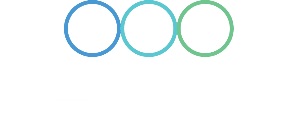
We found that a circle resonates more with our brand as it shows completeness, reliability and protection. The brand-icon was thus created with three circular rings to encompass all the above considerations. The wordmark in the logo was cleaned up to boldly emphasise our name together with the brand-icon that emphasises our core values.
Once the visual identity was ironed out, we started working on re-imagining our digital & physical presence – from ID Cards to Email Signatures, Thumbnails to T-Shirts, Rewards to Notepads.
What's Next?
With our re-imagined brand identity, we set out to work towards our mission of building a more secure digital world. We are gradually rolling out changes in our branding in our internal and external communications. Given the trust we have already built with our clients and partners through our existing brand, over the last 3 years, our plan is to have a carefully strategized transition to the new branding over time. While we do that, you may start noticing some elements change on our emails, website, social media, etc.
We had good help!
We were not alone in our journey to drive these changes to refresh our identity. We had a lot of support from our team, our partners and well-wishers throughout the journey. We were also delighted to have collaborated with our friends at Redtin Studios & 17dNorth along with our inhouse designer Swapnil in leveraging their invaluable experience, while navigating through the creative challenges that arose on the way.

Karthikeyan Krishnan
Co-founder, COO
Karthik is a seasoned entrepreneur with a successful track record across diverse industries like technology, food, fitness, and entertainment. His passion for innovation and building high performance teams has driven growth through skill development

